


.webp)

.webp)
.webp)


.webp)
.webp)
Application Design System
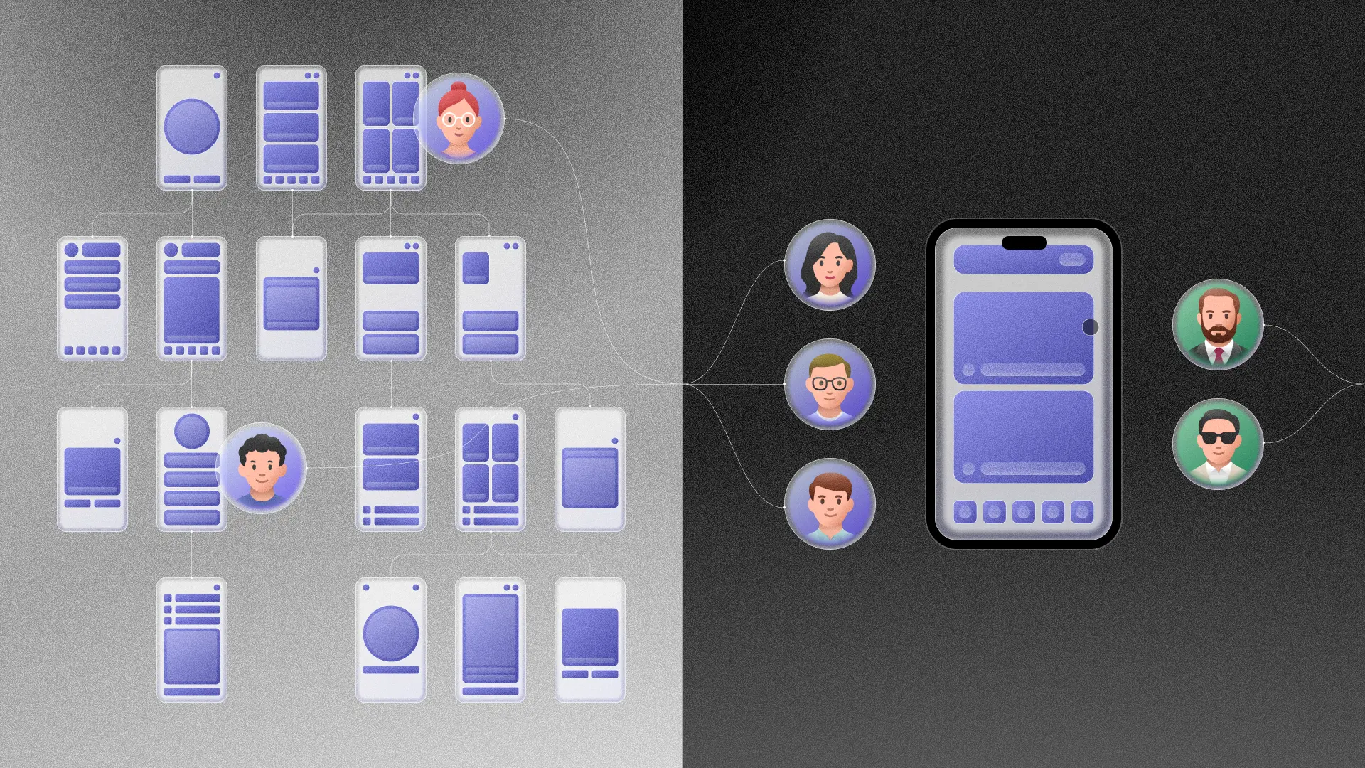
Architecture
Implementation
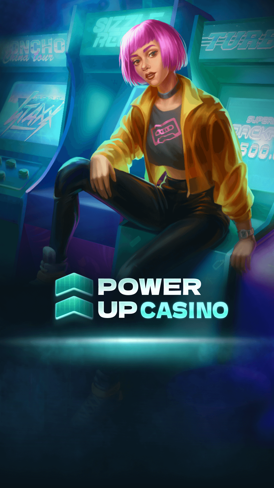
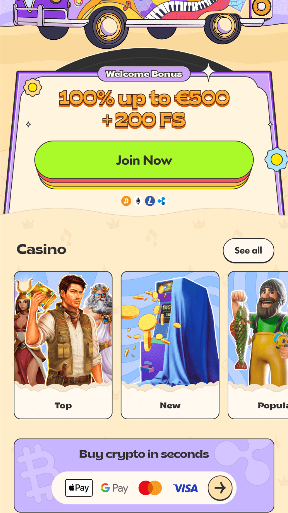
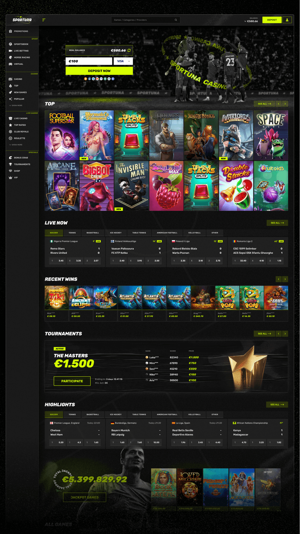
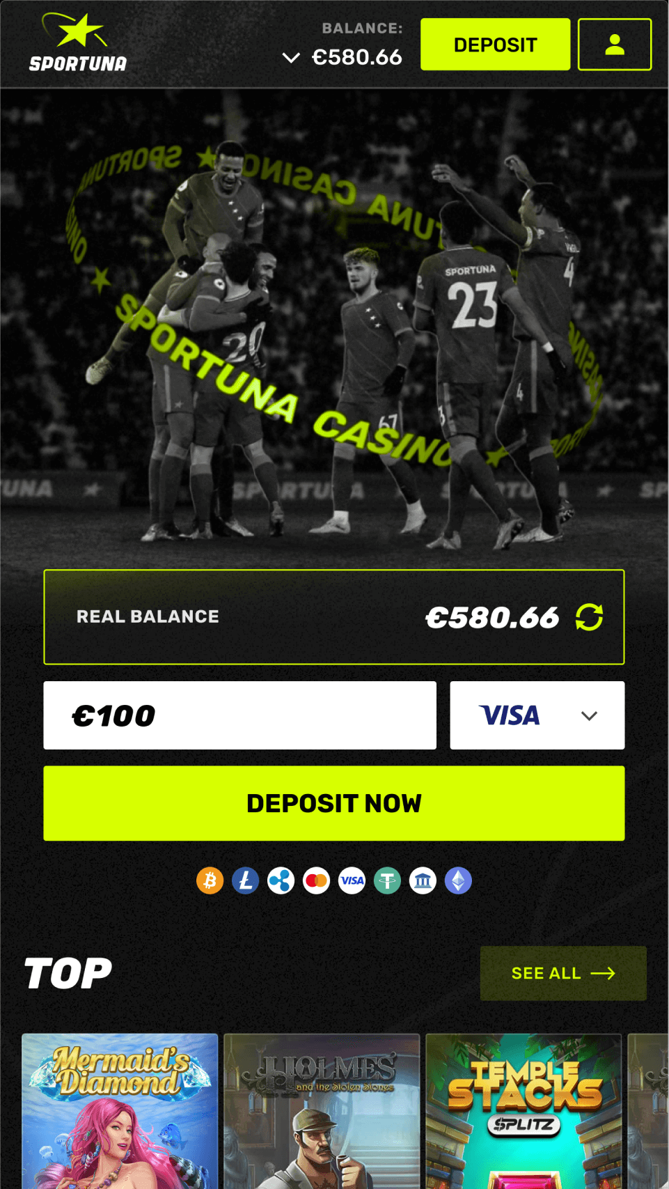
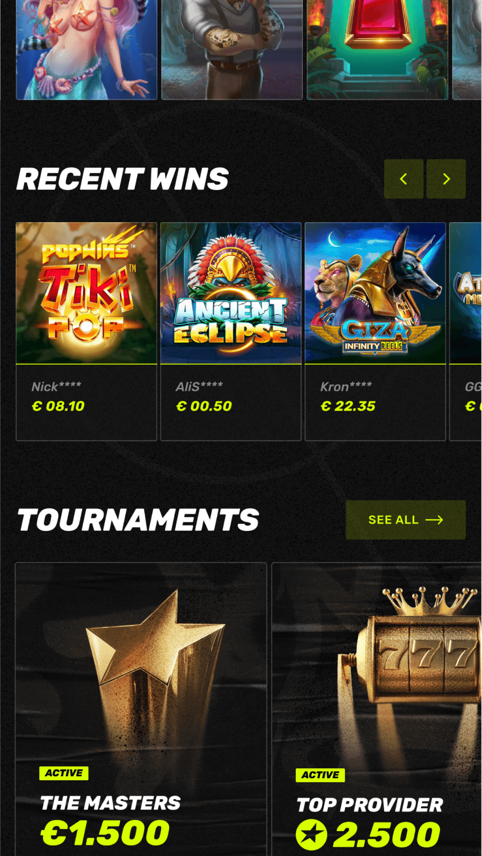
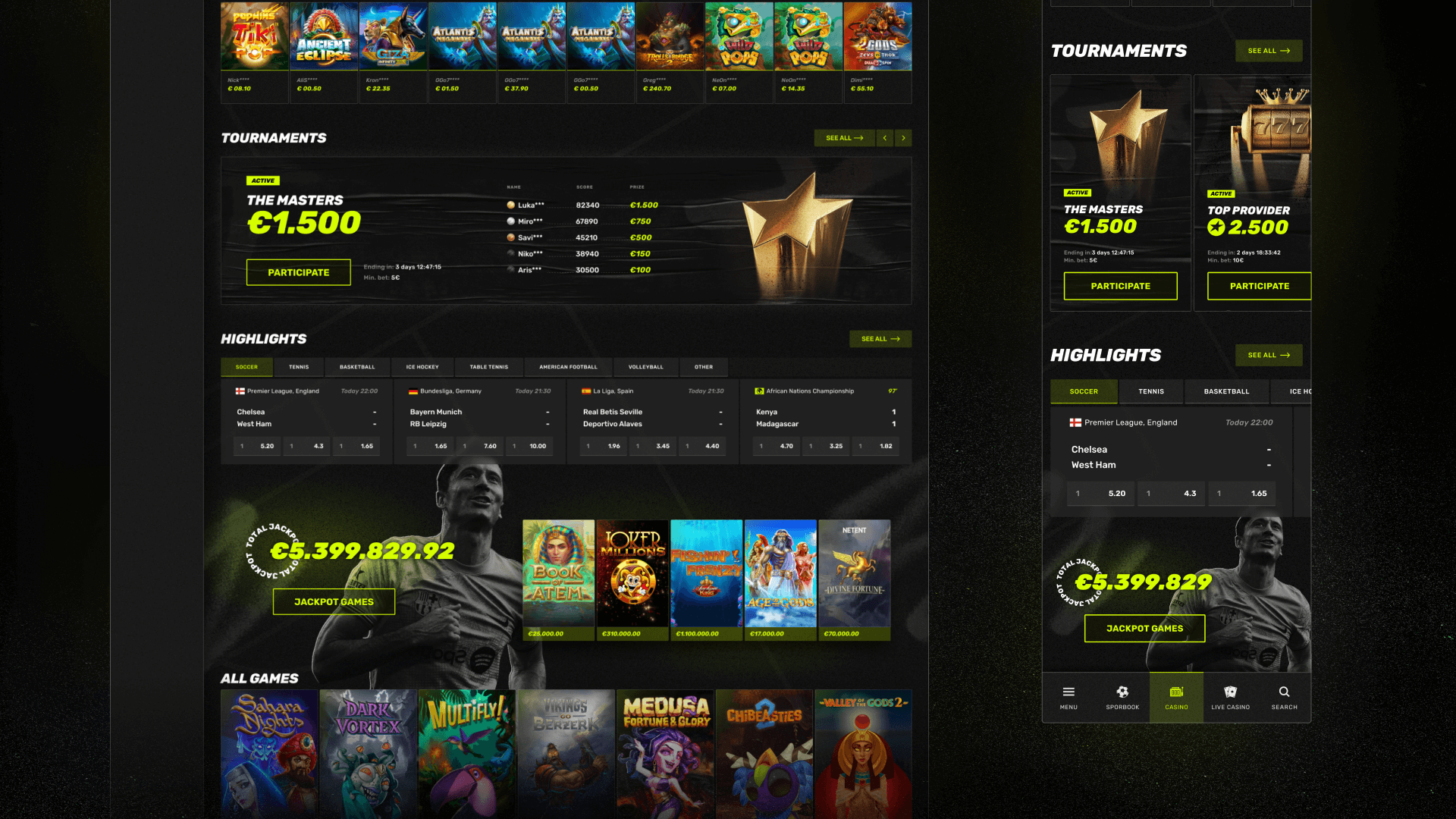
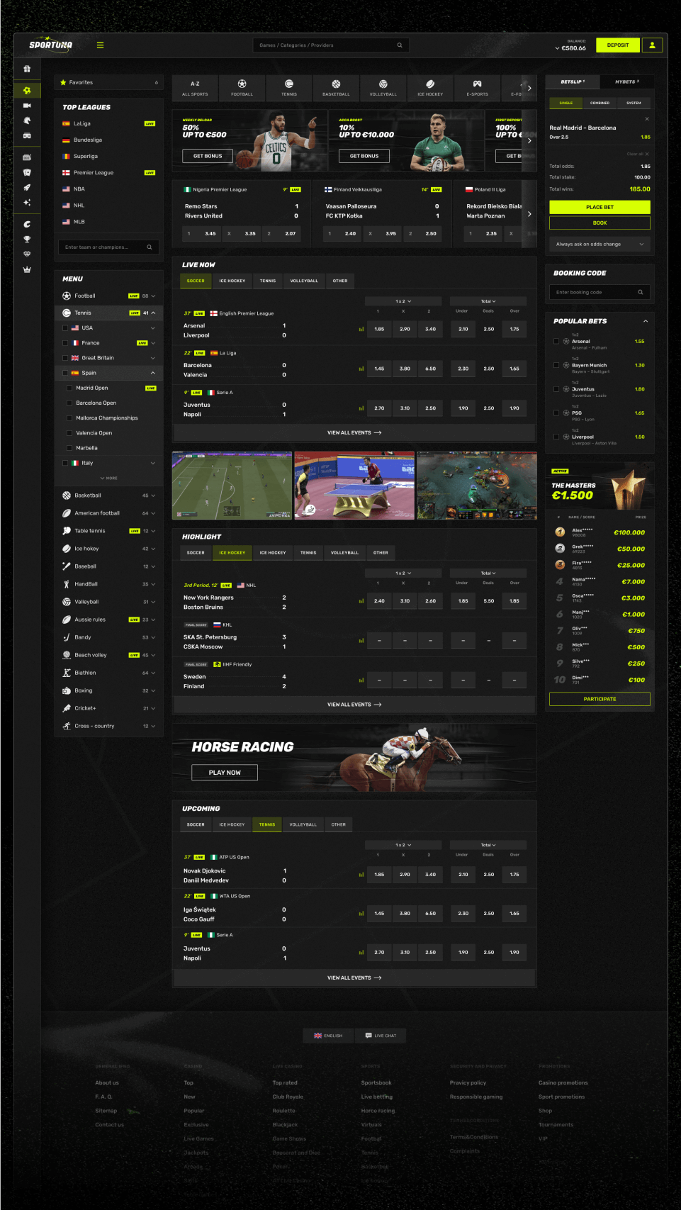
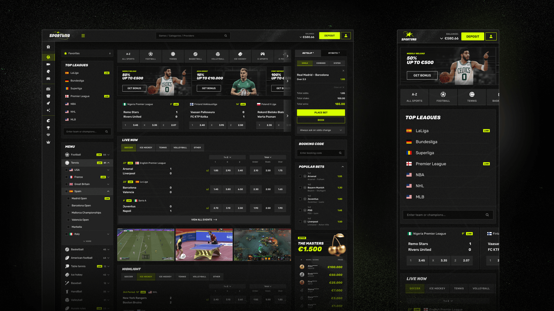
An internal tool for building mobile apps
The design system for mobile apps (name of the system and company not disclosed) was created to make the process of building apps simpler, faster, and more structured — and to set the stage for future growth. The company kept raising the bar for the mobile team, and it was clear that more and more products would need to be launched going forward.
Back then, every app was designed as a one-off project with no shared system. This led to all kinds of problems: repeated mistakes, messy mockups and repos, issues with scaling, delays when adding new features, and misalignment between design and development.
We needed a system — something that would help us build apps quicker and update them without stress or loss in quality.
Goals
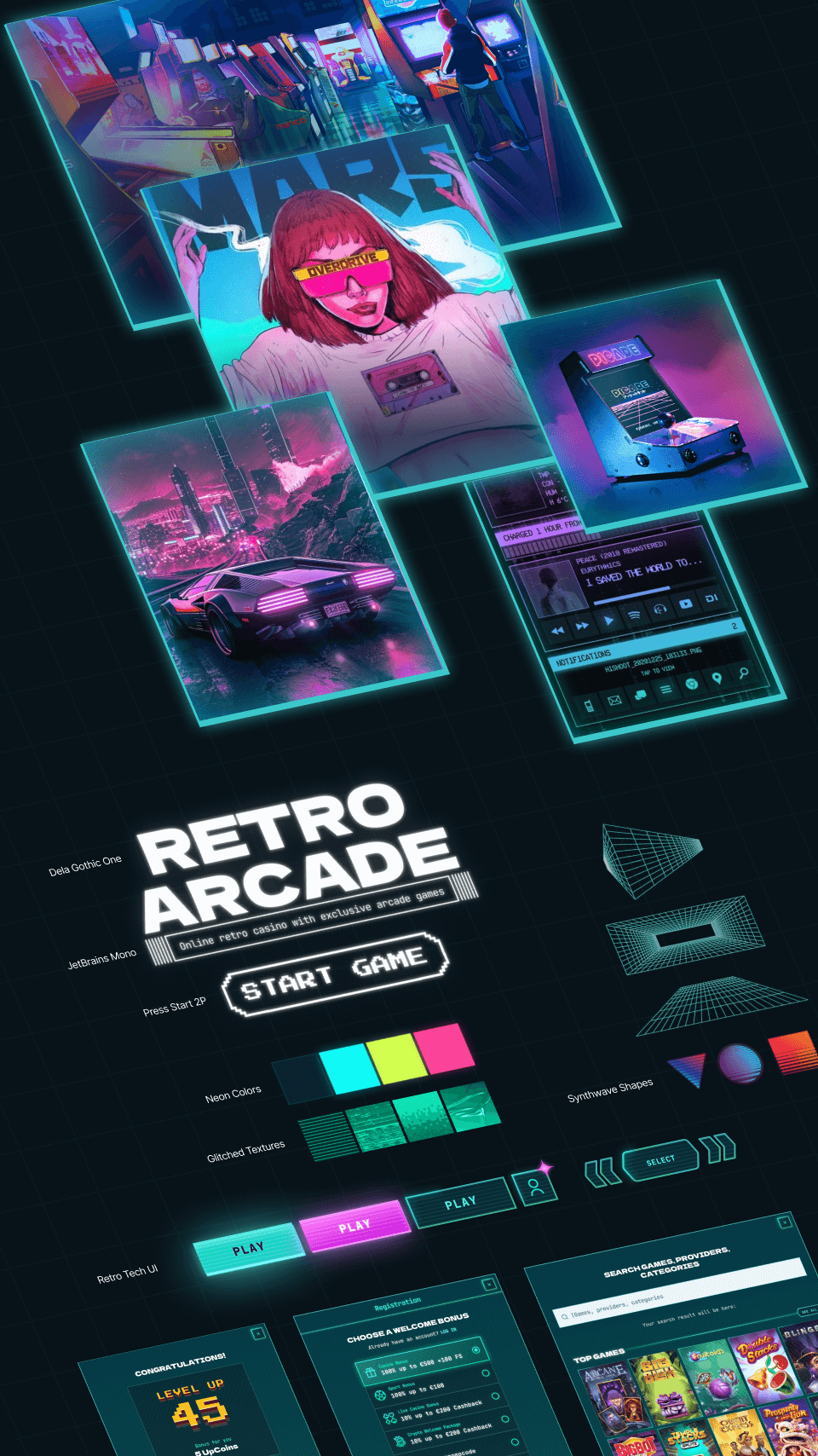
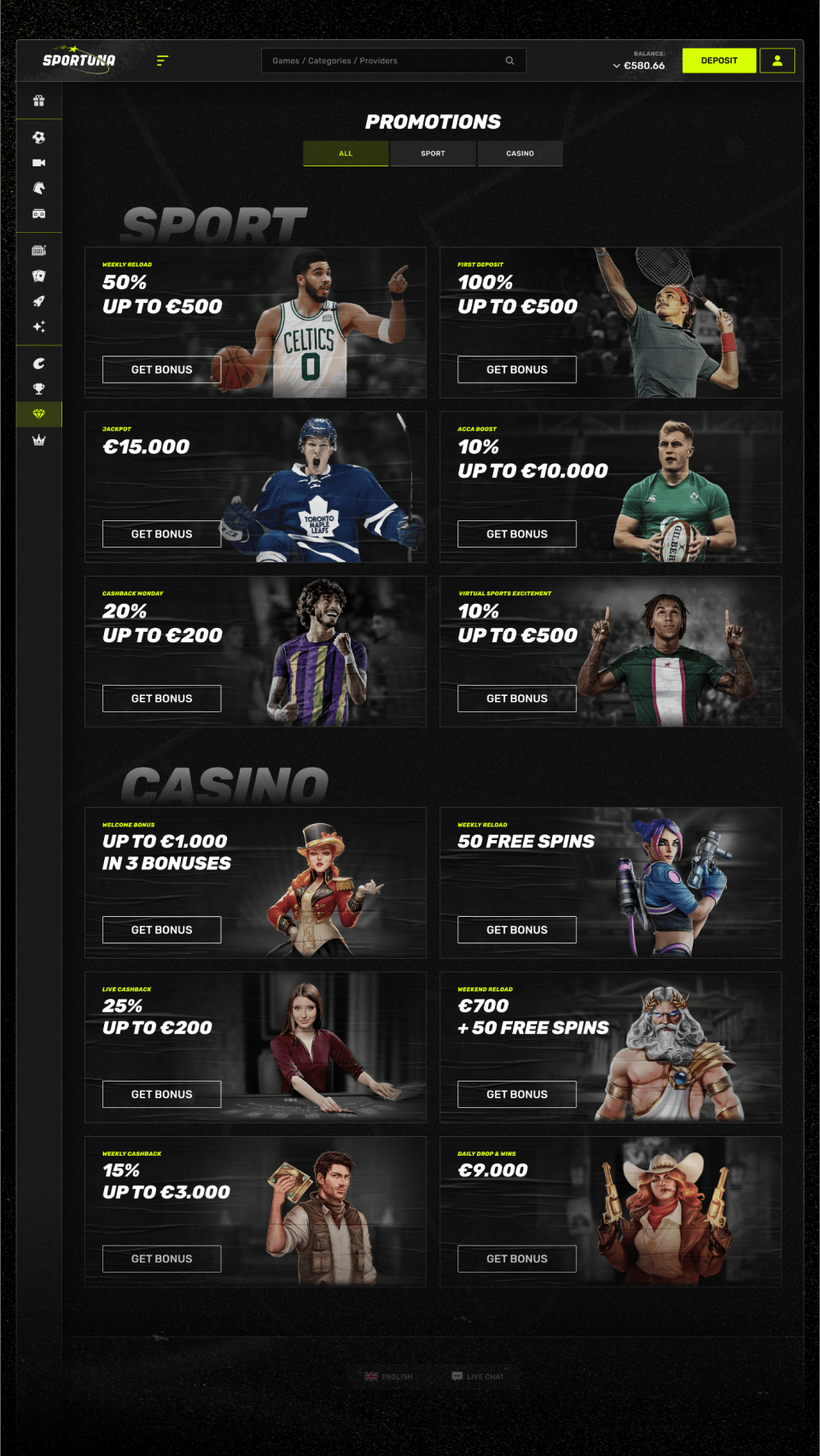
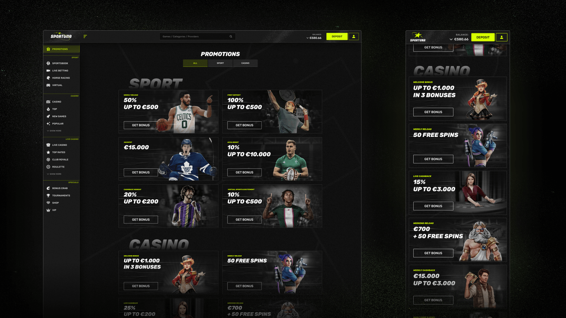
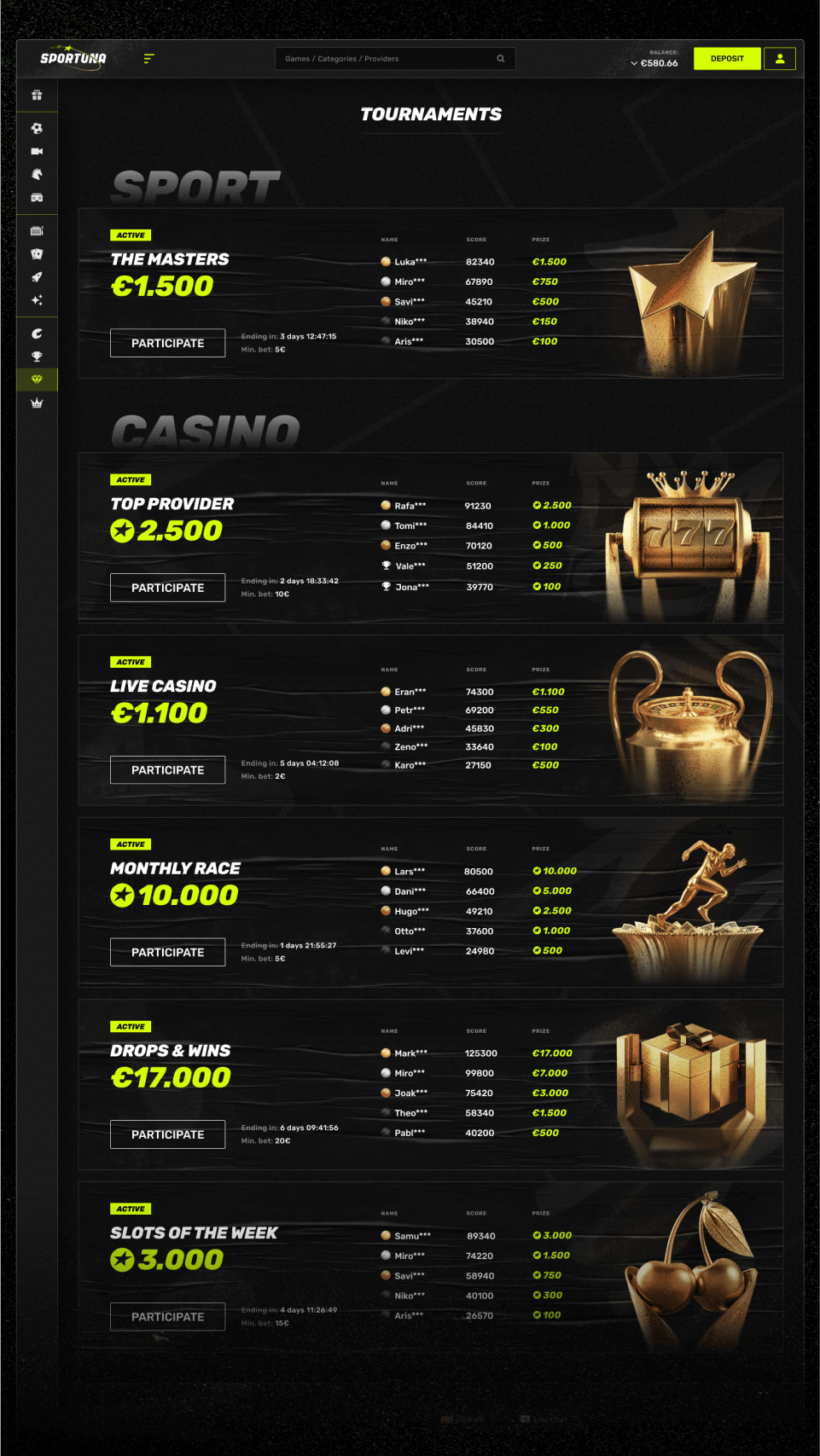
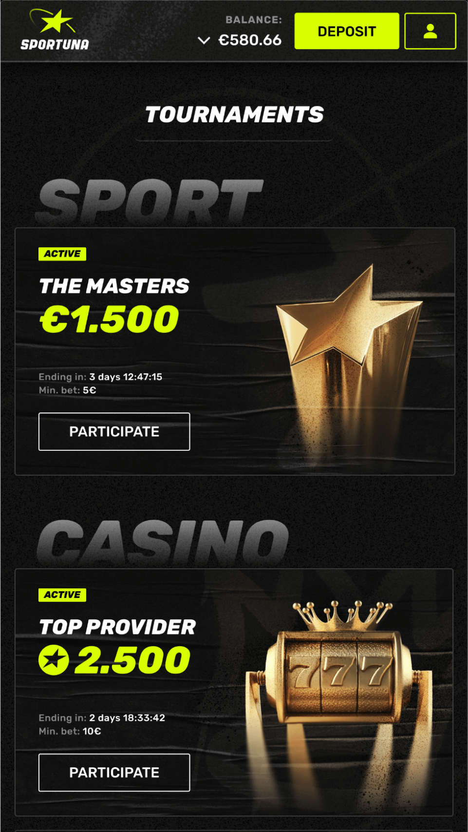
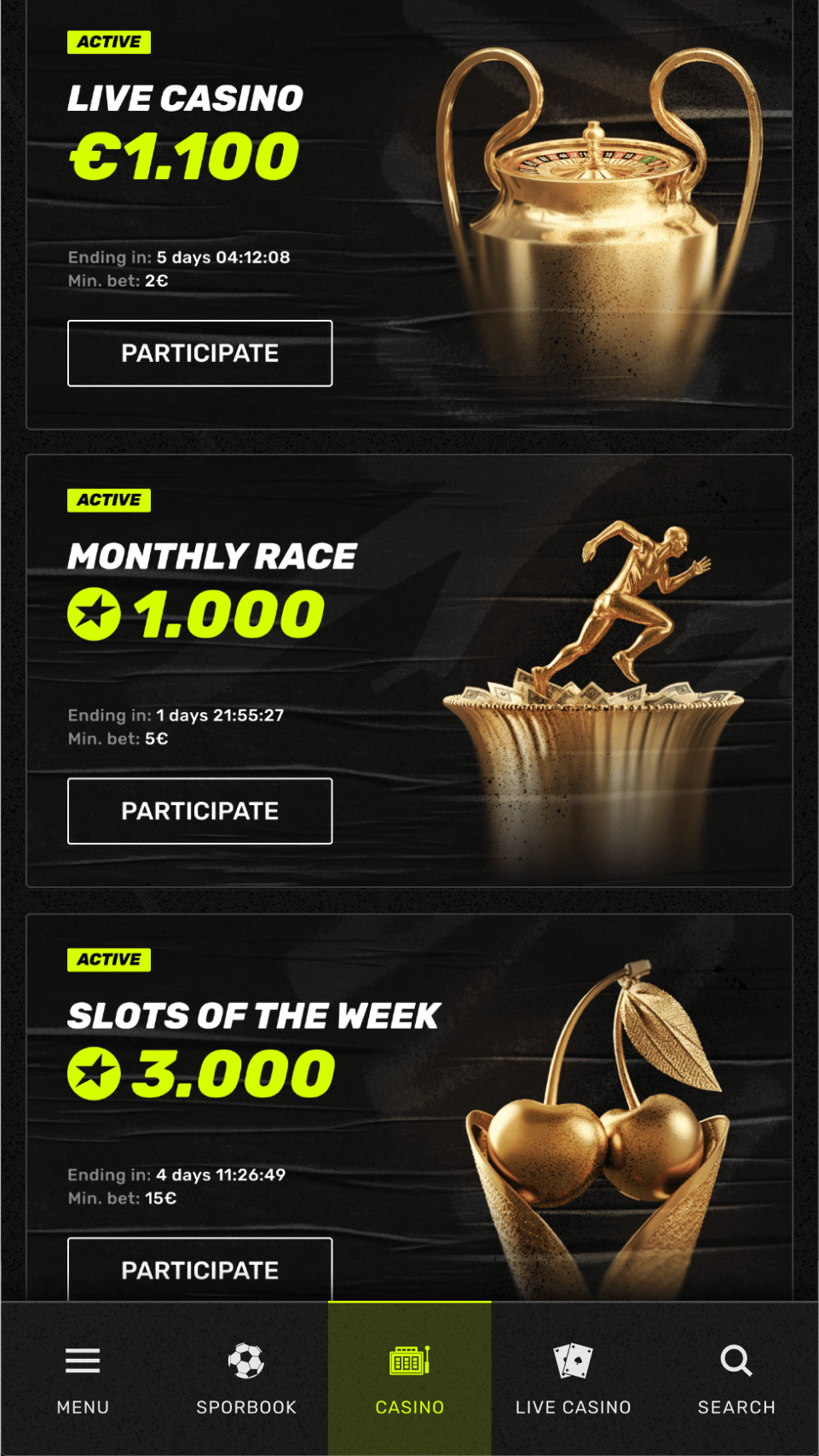
Most of the company’s products followed typical patterns — but with a strong focus on visual style. The design system had to do both: make it easy to scale standard solutions and support visual variety and artistic expression.
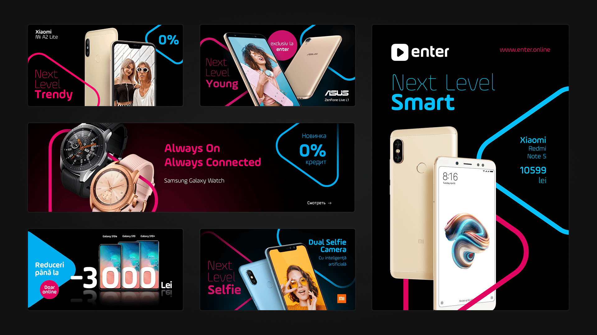
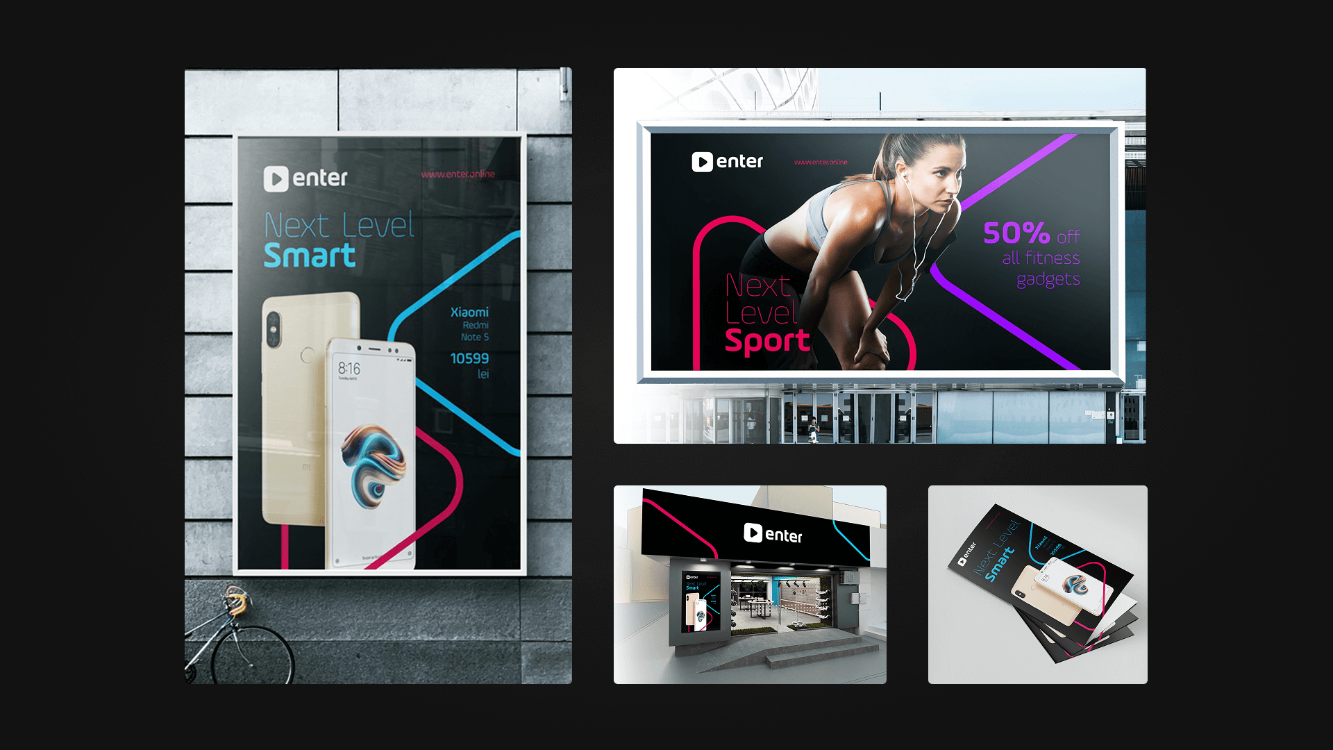
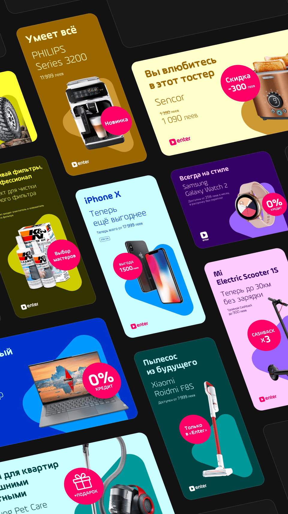
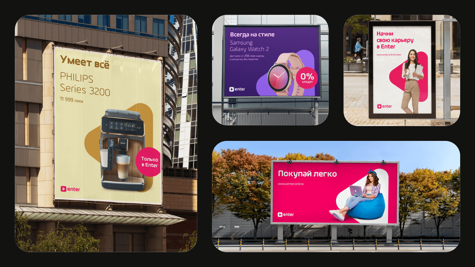
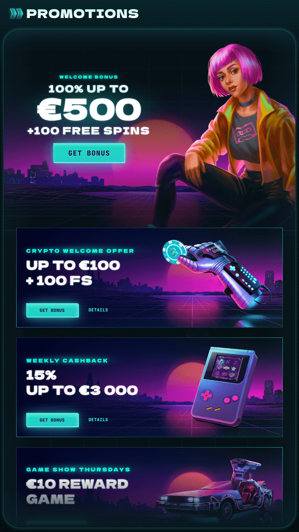
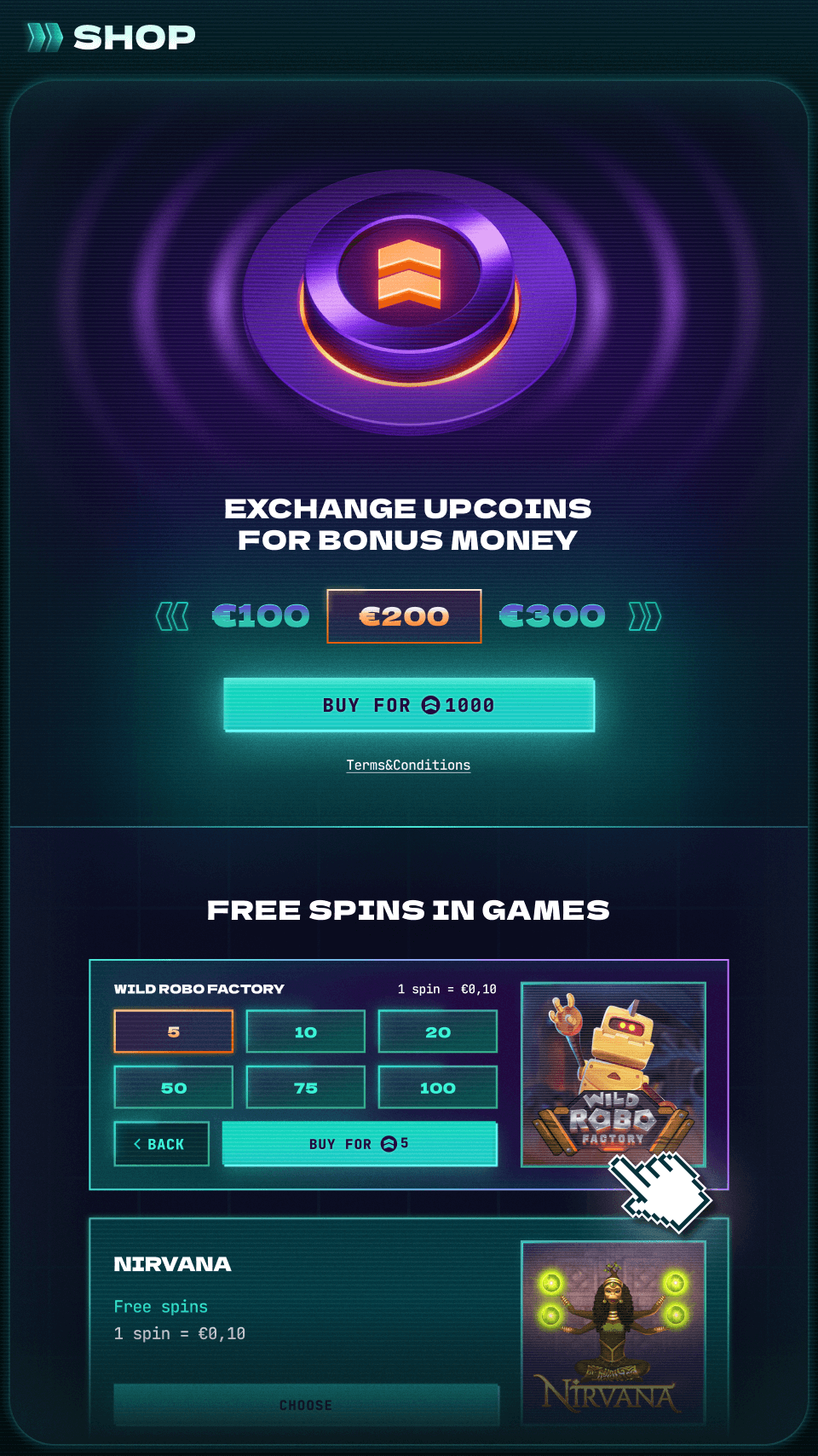
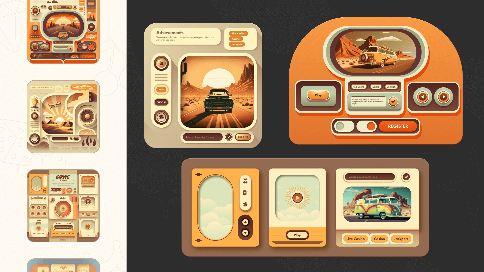
We knew that for designers to really adopt the system, it couldn’t just speed things up — it had to leave space for creativity. So we focused on cutting down product and tech-related routine and letting designers spend more time on the visual side. Stylistically, the interfaces felt more like game UI: with decorative elements, overlays, patterns, expressive typography, and animations. That meant the system had to be flexible and highly customizable — not something that would box anyone in.
All of this came down to one simple business goal: building visually rich, detail-heavy products — fast.
Implementation
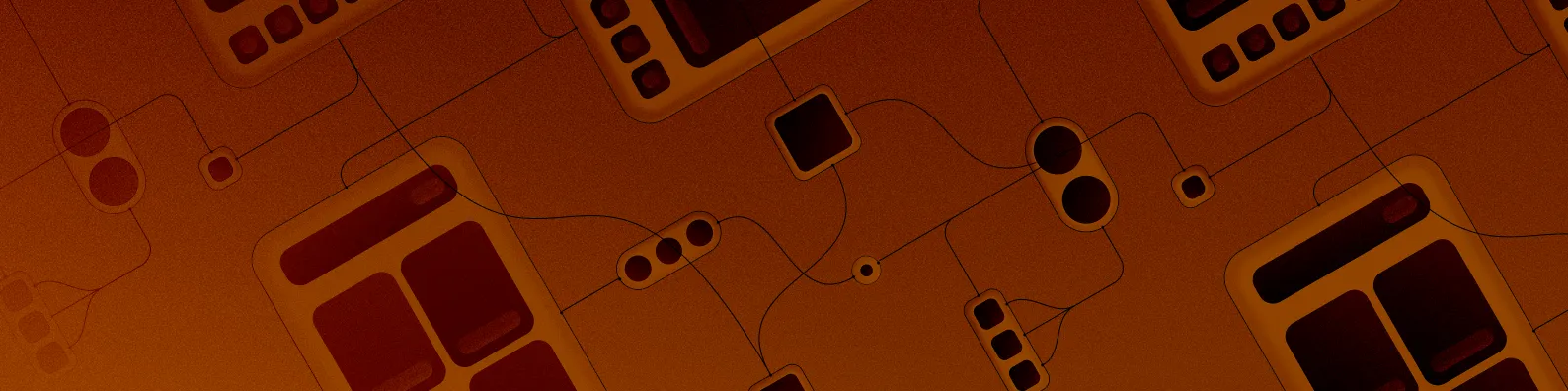
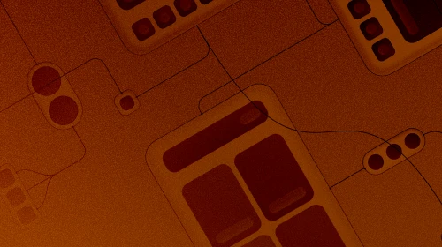
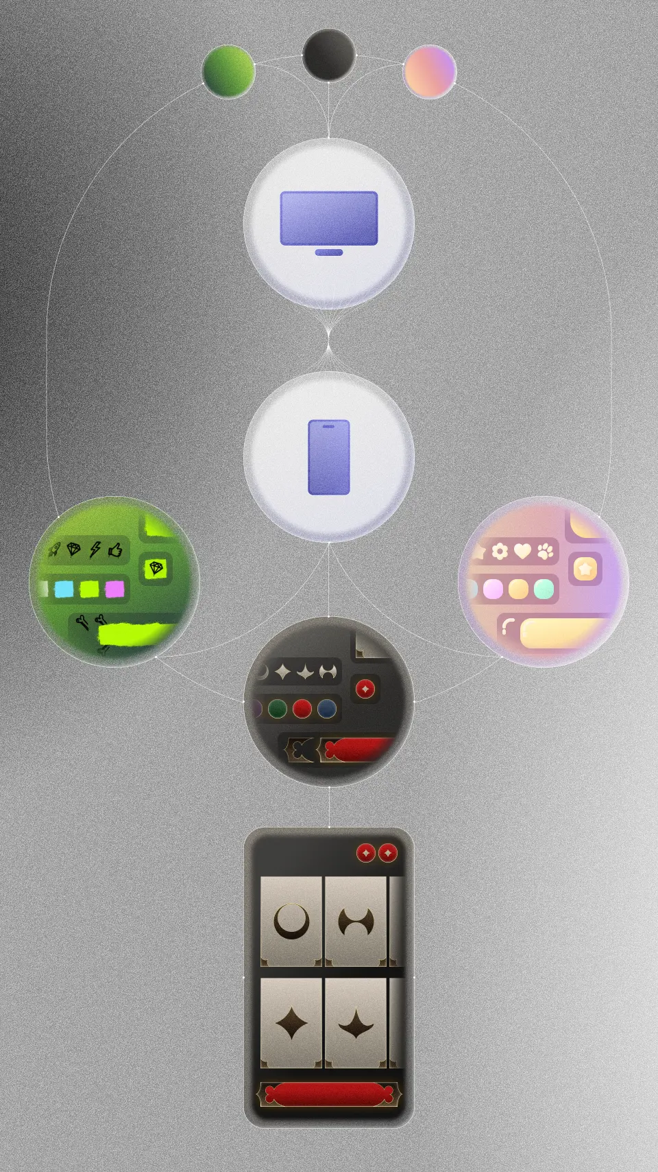
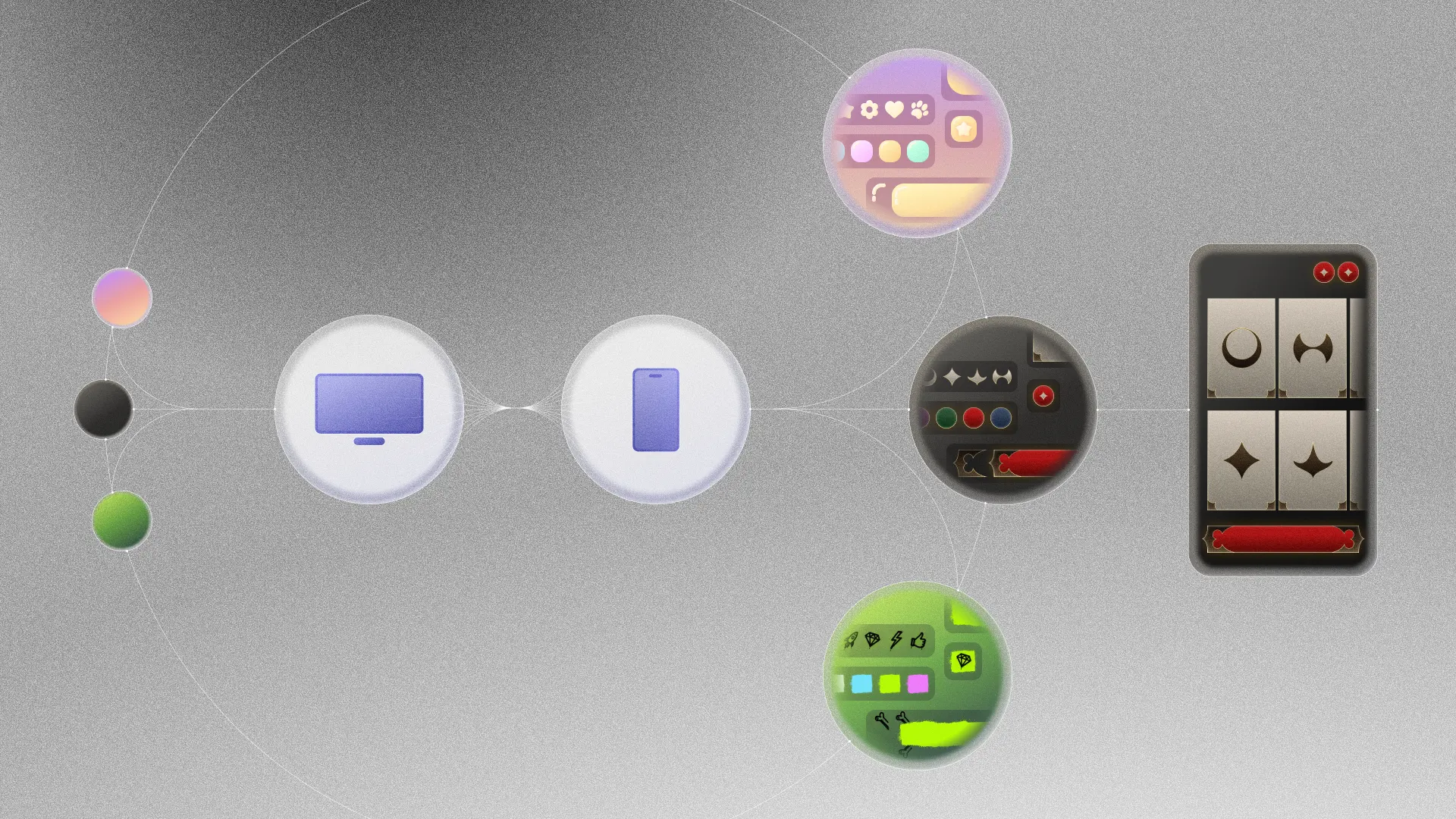
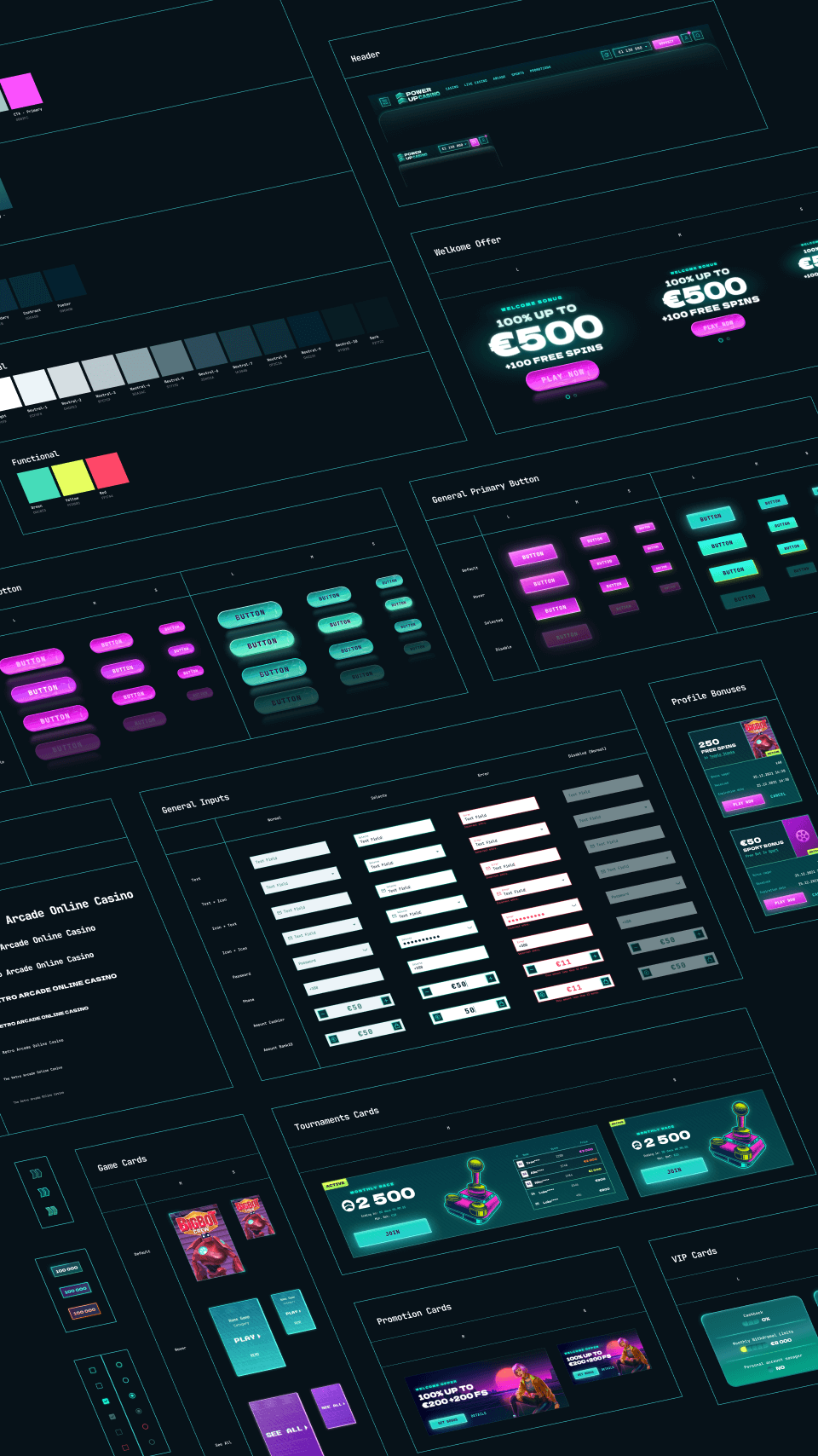
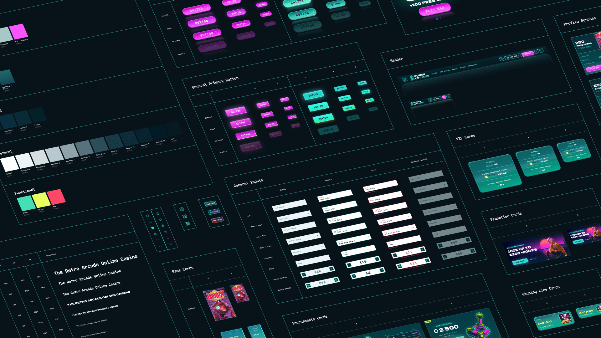
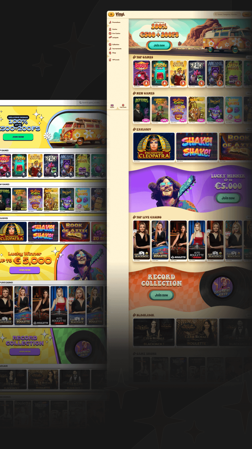
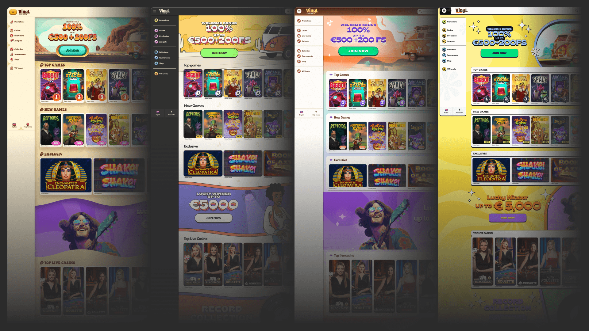
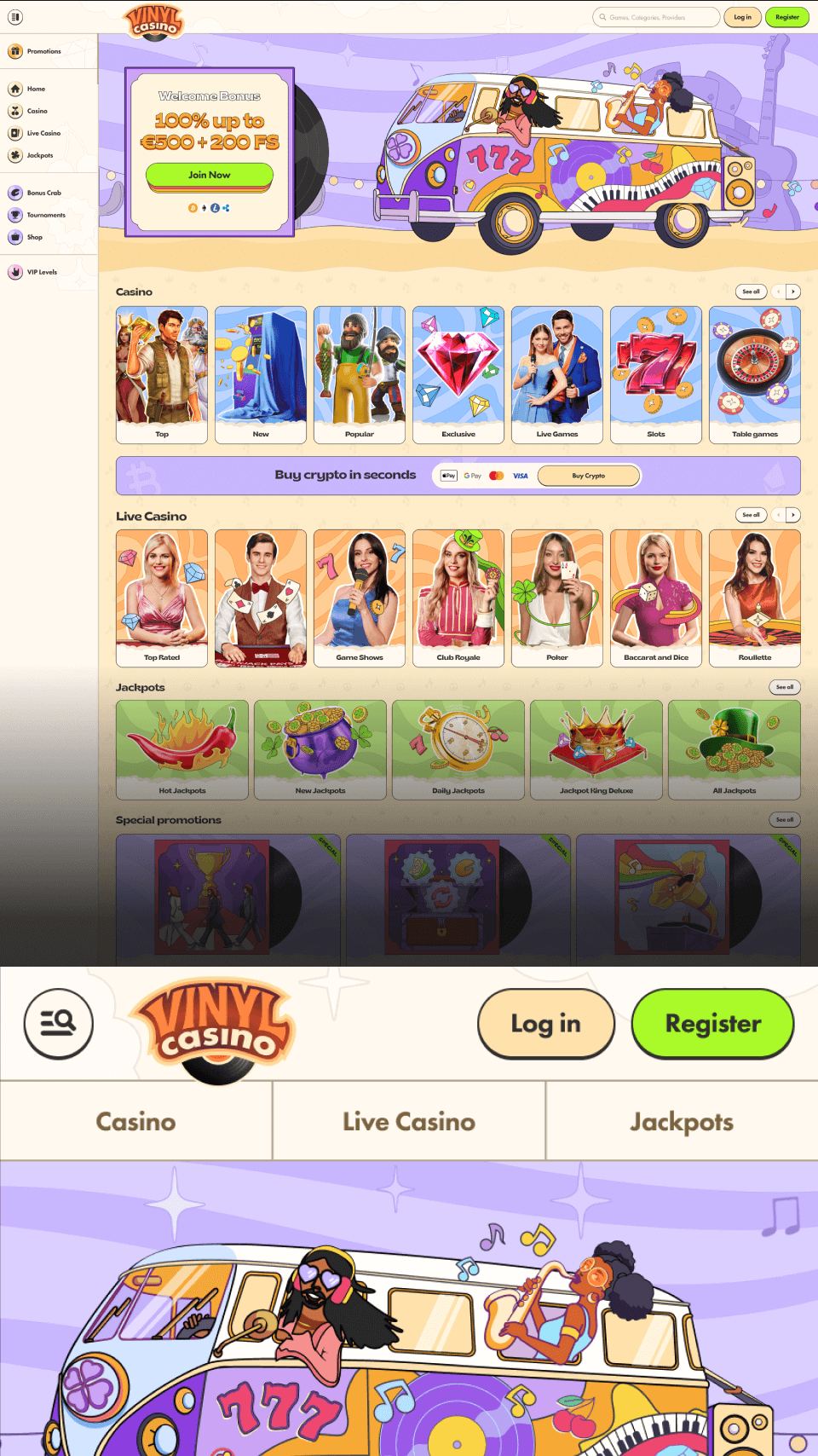
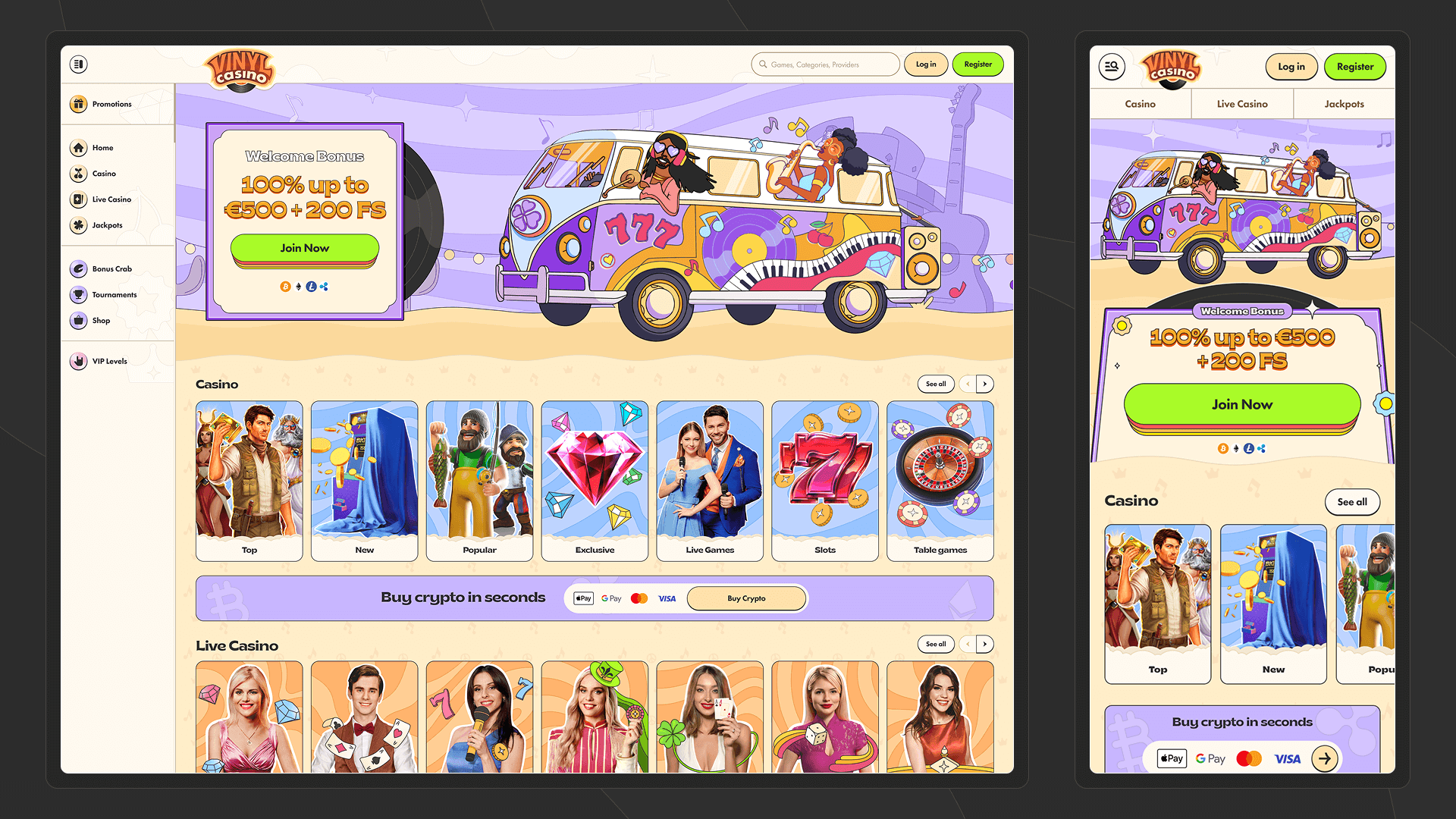
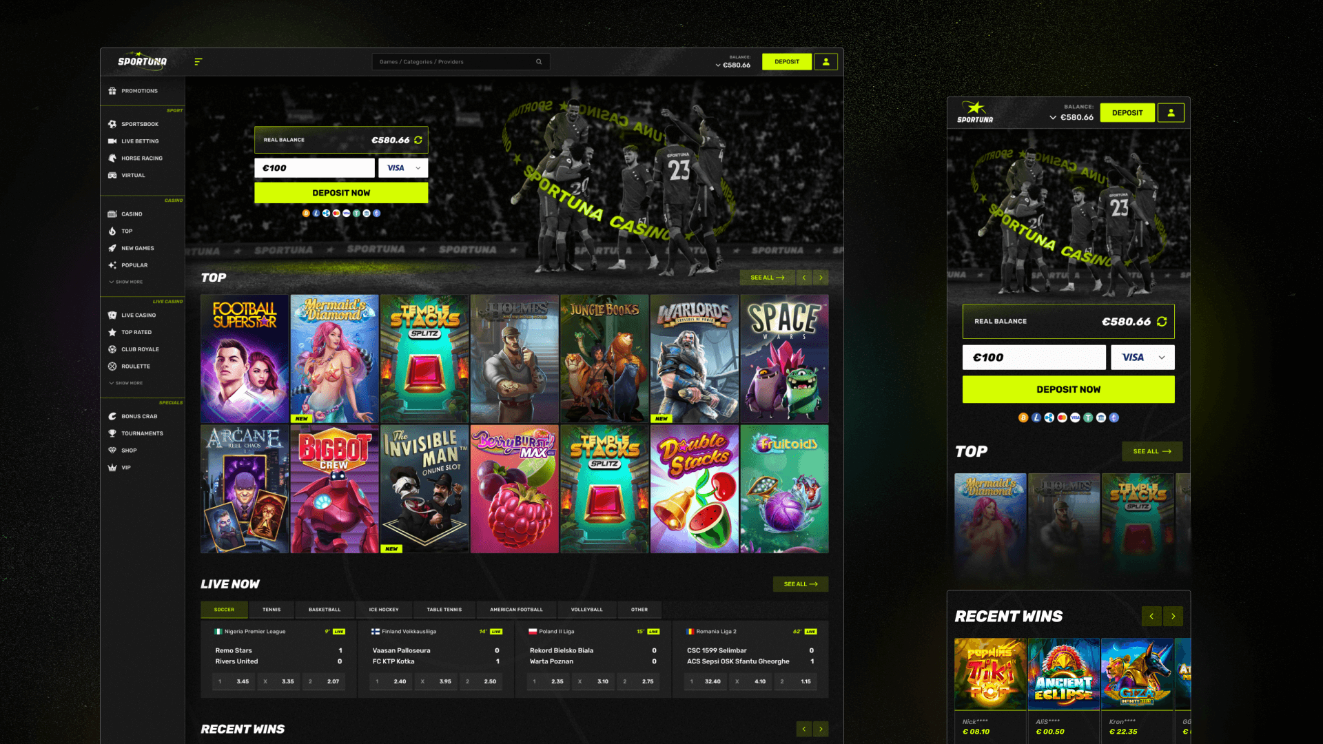
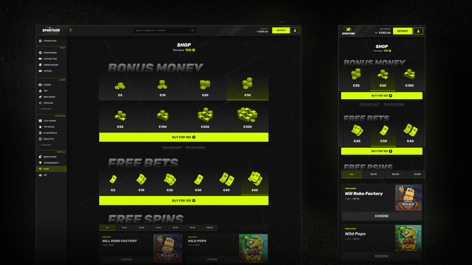
Together with the mobile dev and design systems teams, we decided not to start from scratch. Instead, we built on the existing web design system. That way, every update to the shared component library worked for both web and mobile — helping us create a more connected ecosystem.
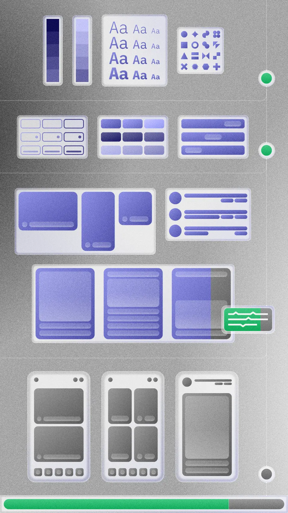
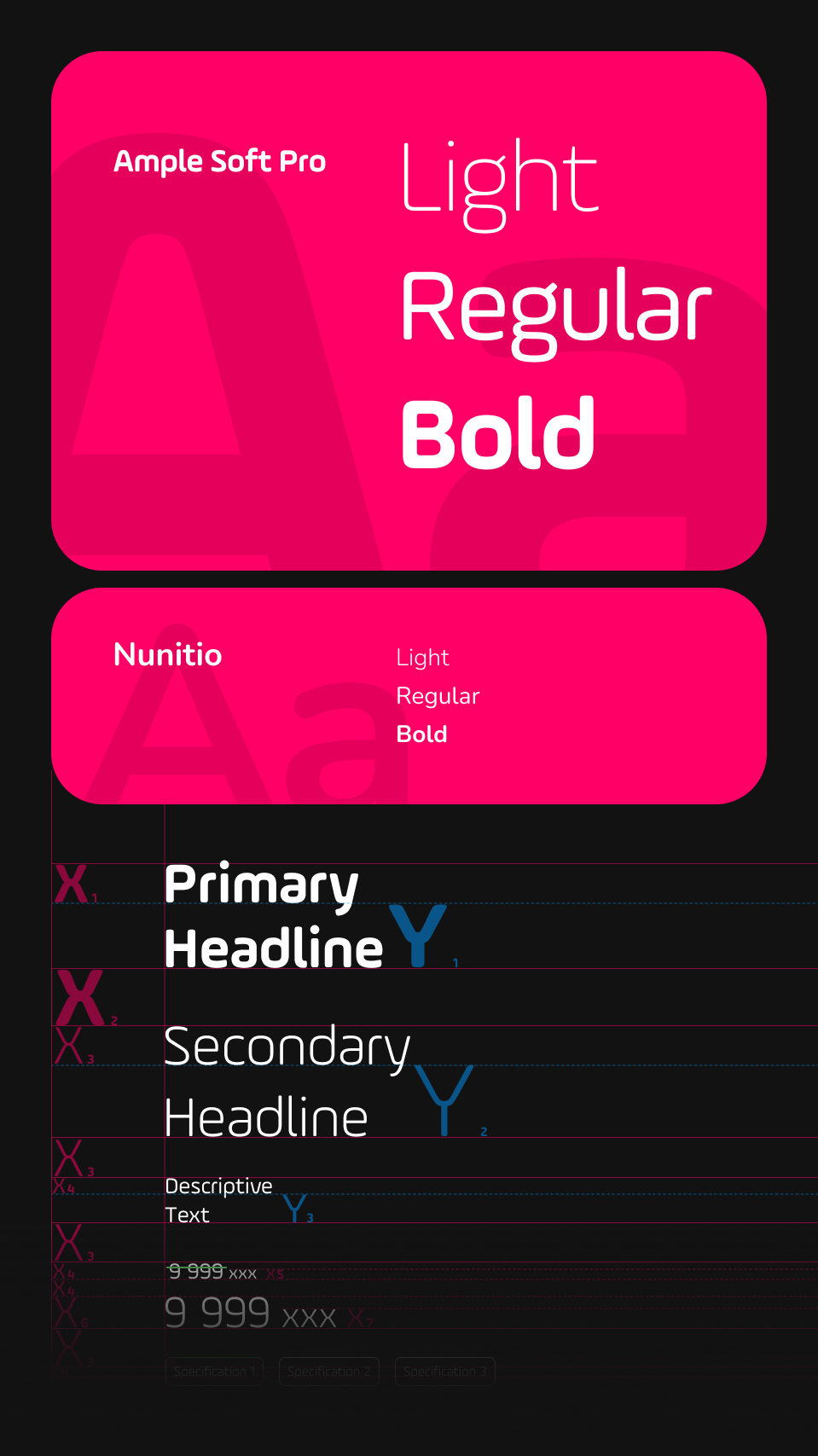
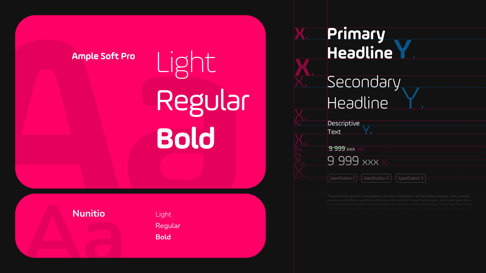
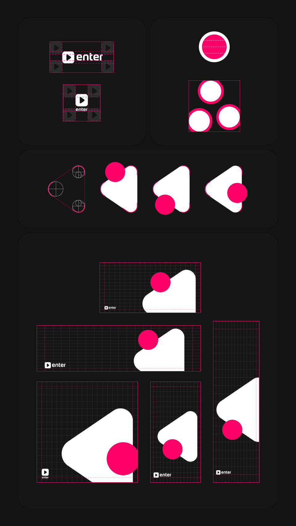
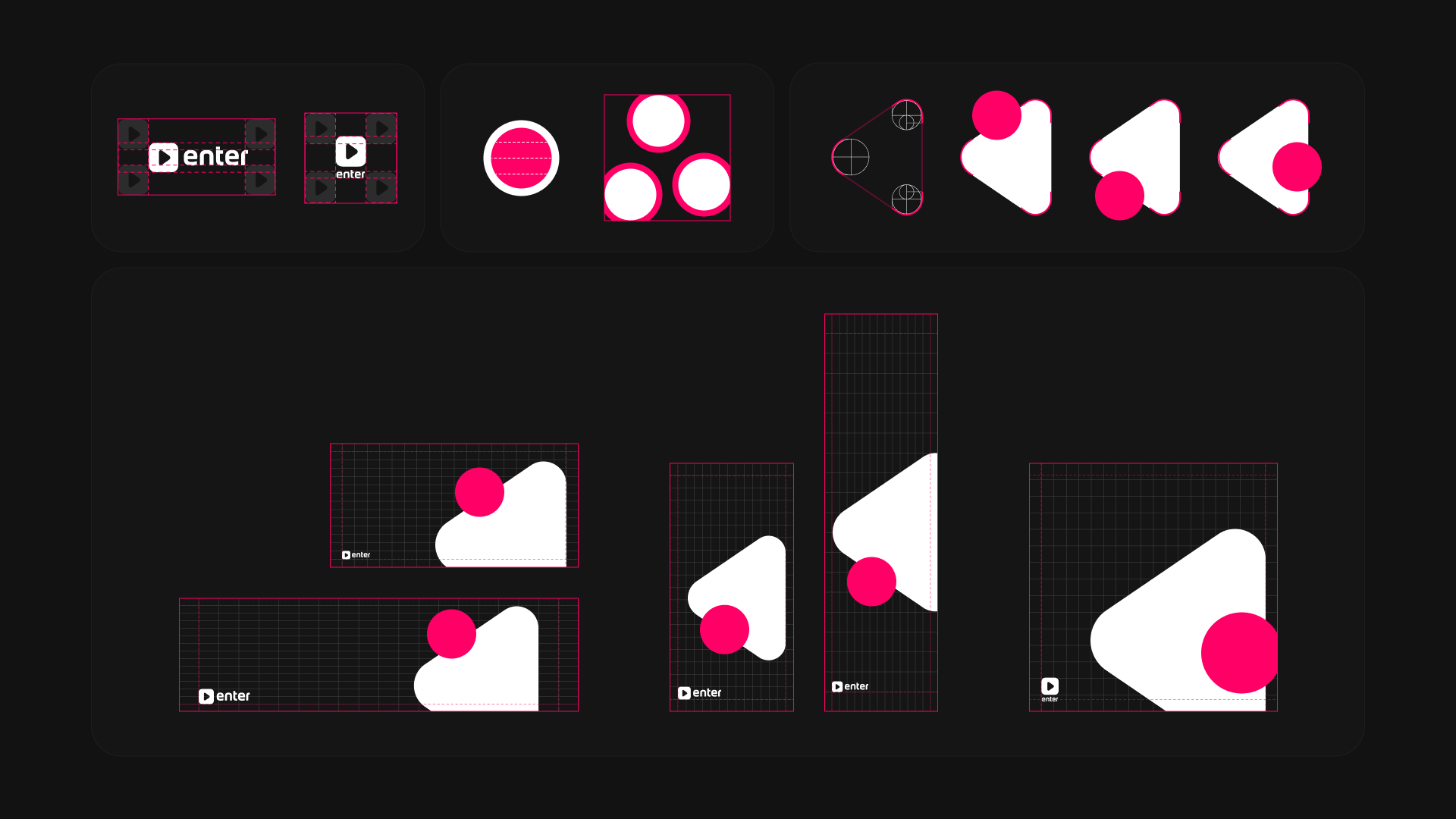
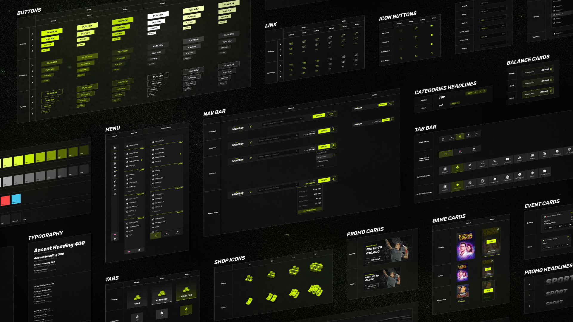
The system was based on existing web components. We reused atomic and molecular elements, tokens, color and type scales, and content templates — then extended all of that with mobile-specific UI elements.
The system was based on existing web components. We reused atomic and molecular elements, tokens, color and type scales, and content templates — then extended all of that with mobile-specific UI elements.
We kept the file structure organized:
• Main Library — base components, styles, and web layout templates.
• Web Pages — full pages in all breakpoints.
• Web Use Cases — flow prototypes for user scenarios.
• App Library — mobile components, extra tokens, screens, and use case flows.
• Main Library — base components, styles, and web layout templates.
• Web Pages — full pages in all breakpoints.
• Web Use Cases — flow prototypes for user scenarios.
• App Library — mobile components, extra tokens, screens, and use case flows.
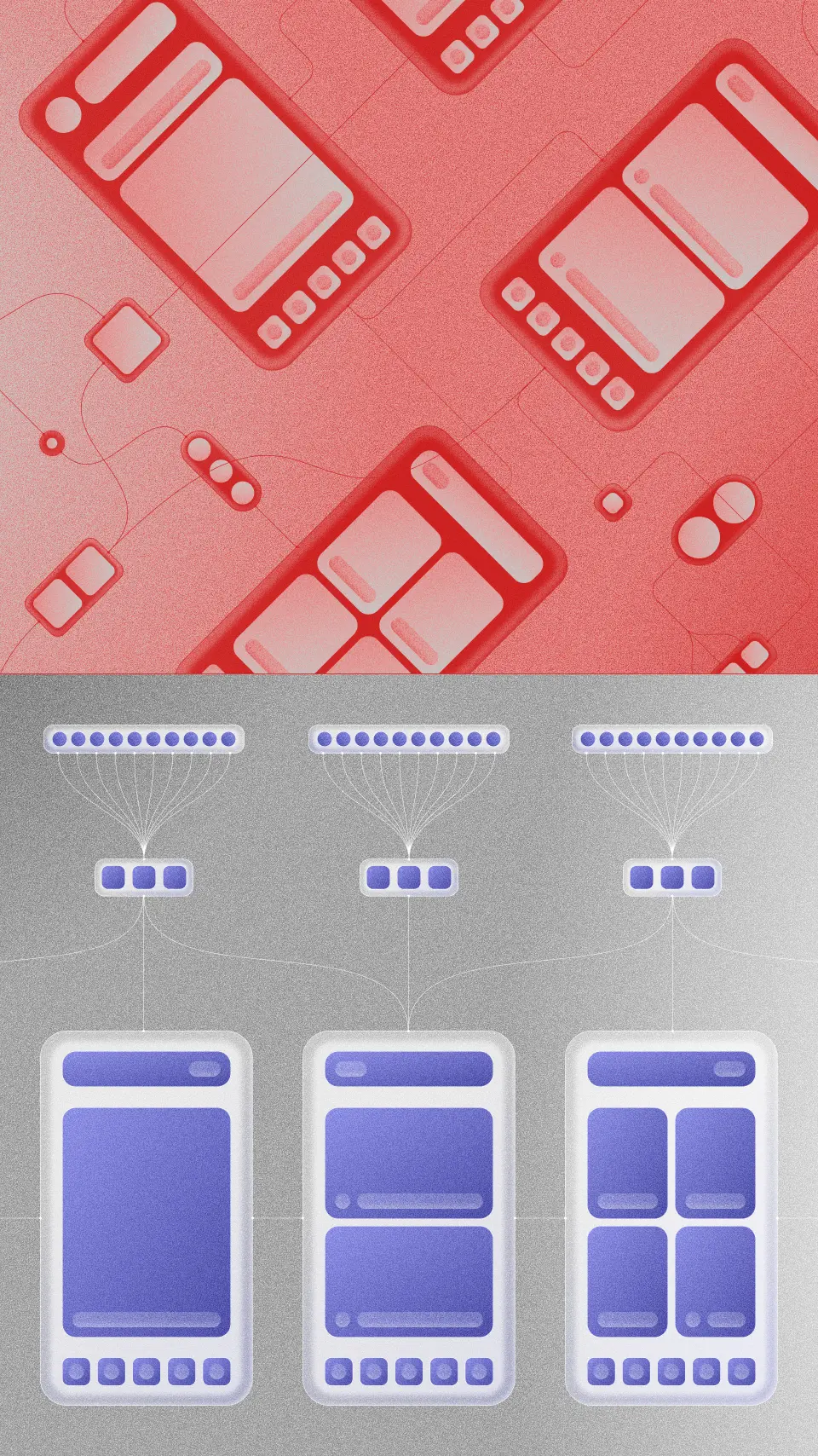
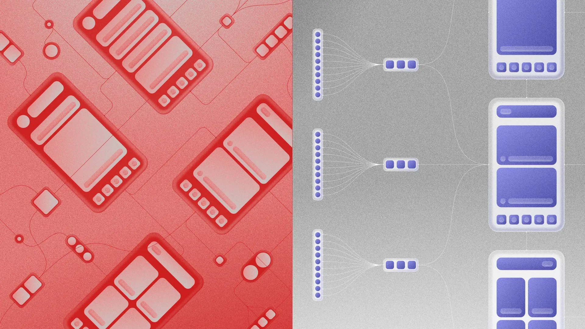
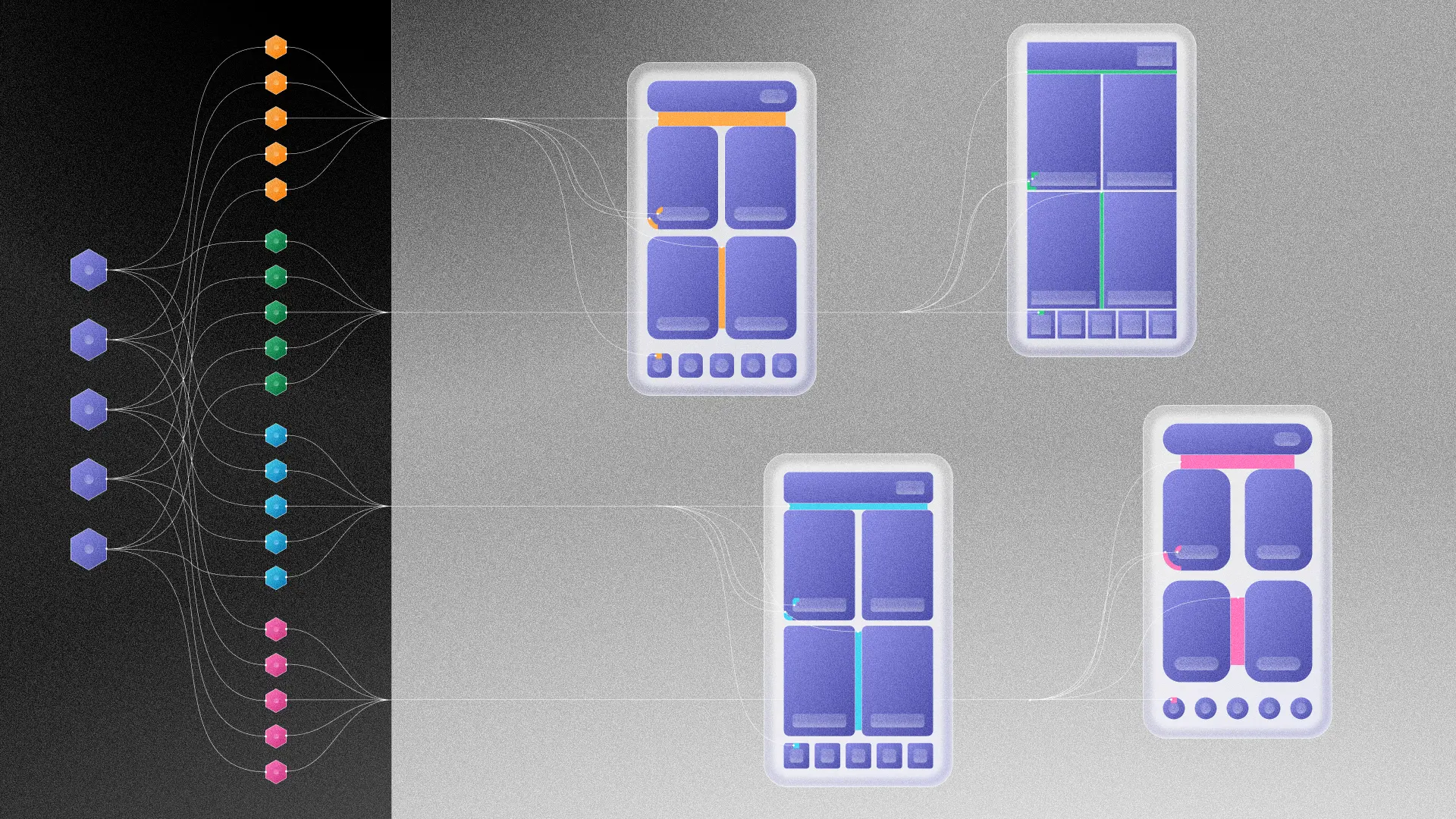
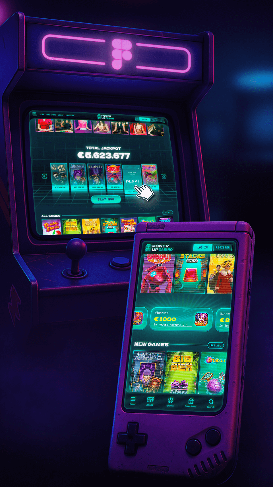
All libraries were connected. By default, the system library was applied — but to switch the visuals to match a product, we just swapped in a project-specific library, and everything updated automatically.
While building out the system, I also analyzed the company’s current mobile products, reviewed competitors, and explored mobile UI patterns. Based on that, I created test layouts that went through several review stages: first with product managers and analysts, then syncs with developers for feasibility, then internal design system reviews — and finally, integration into the library.
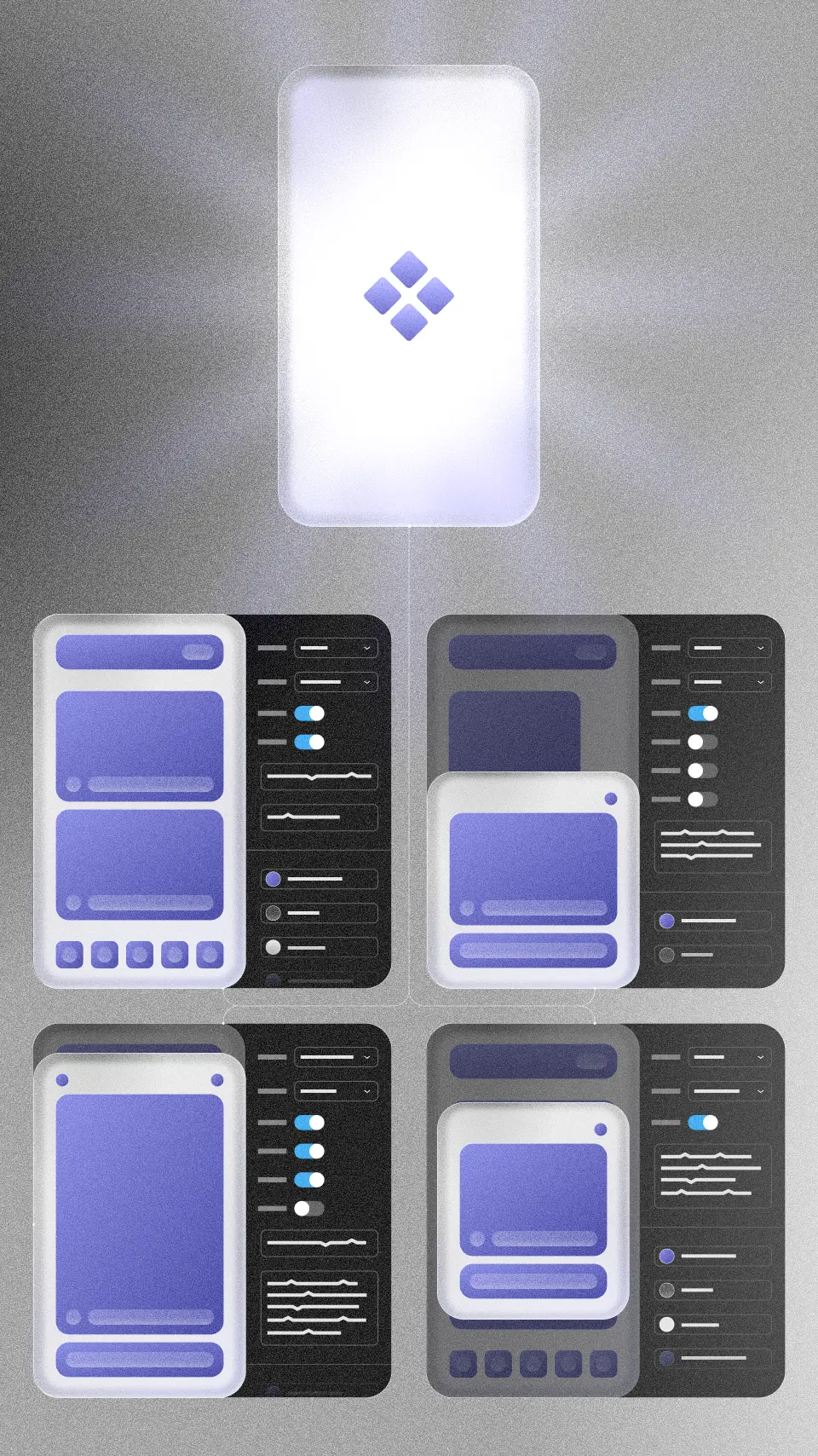
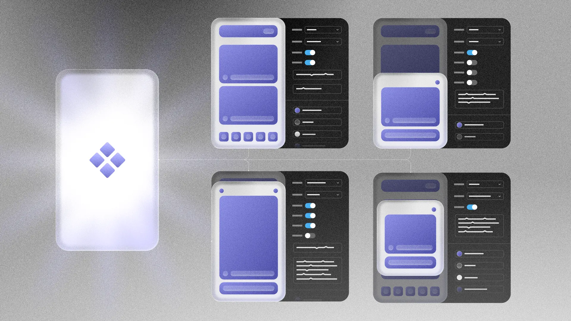
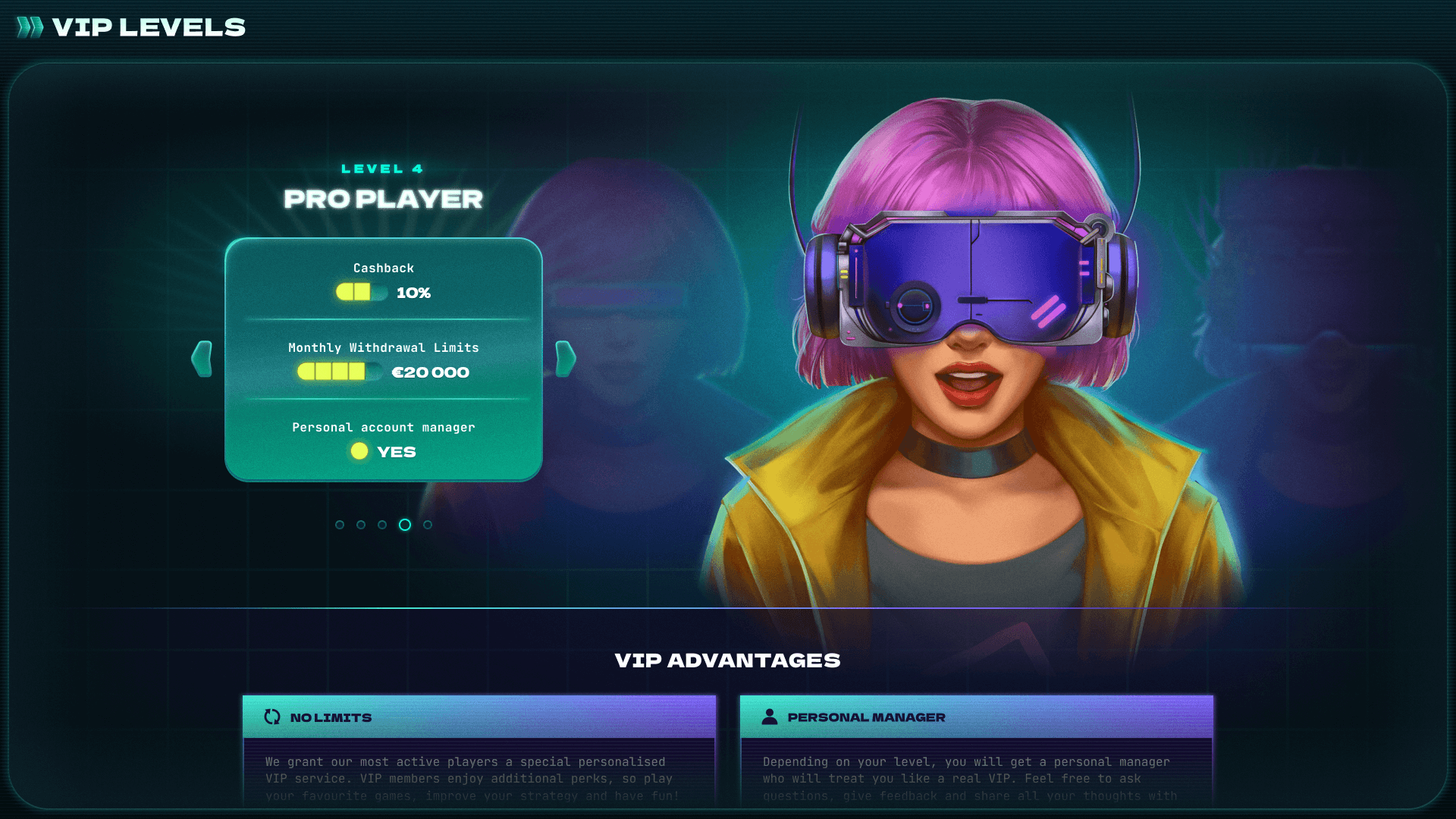
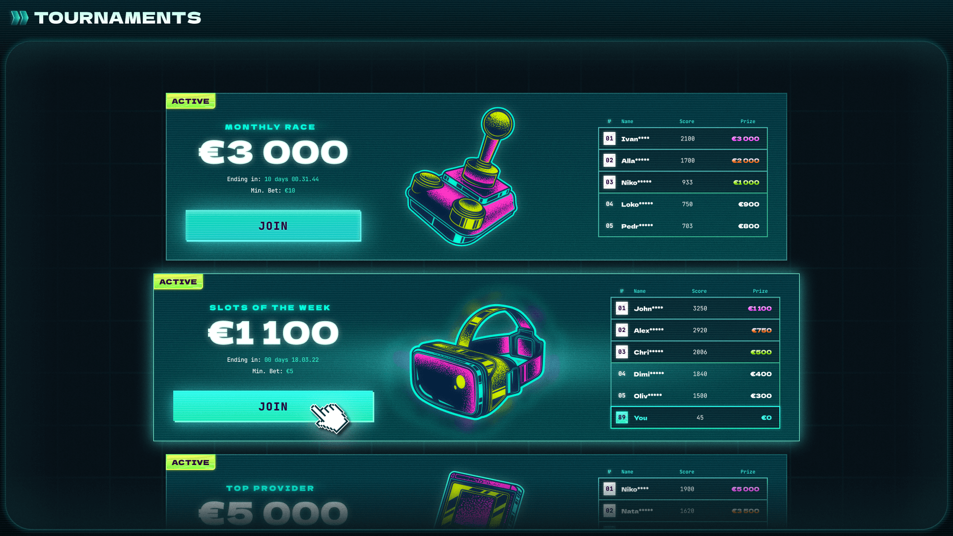
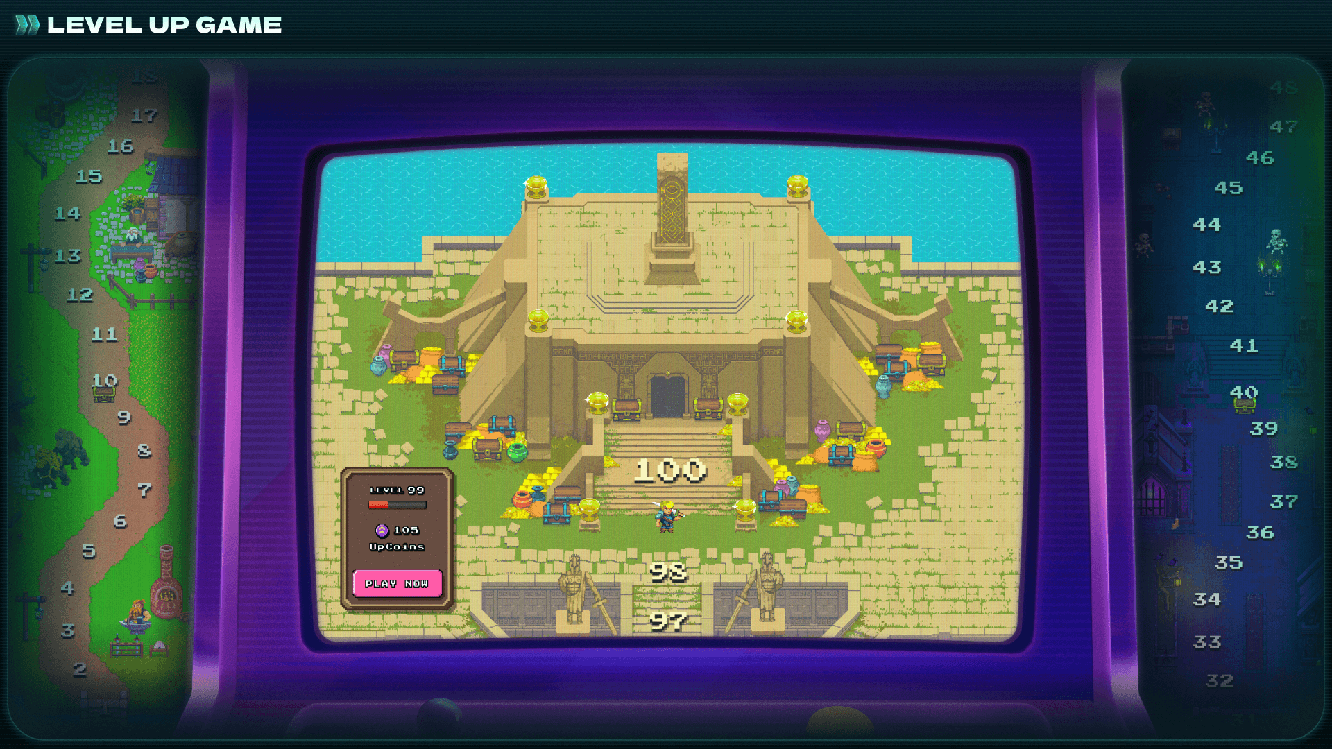
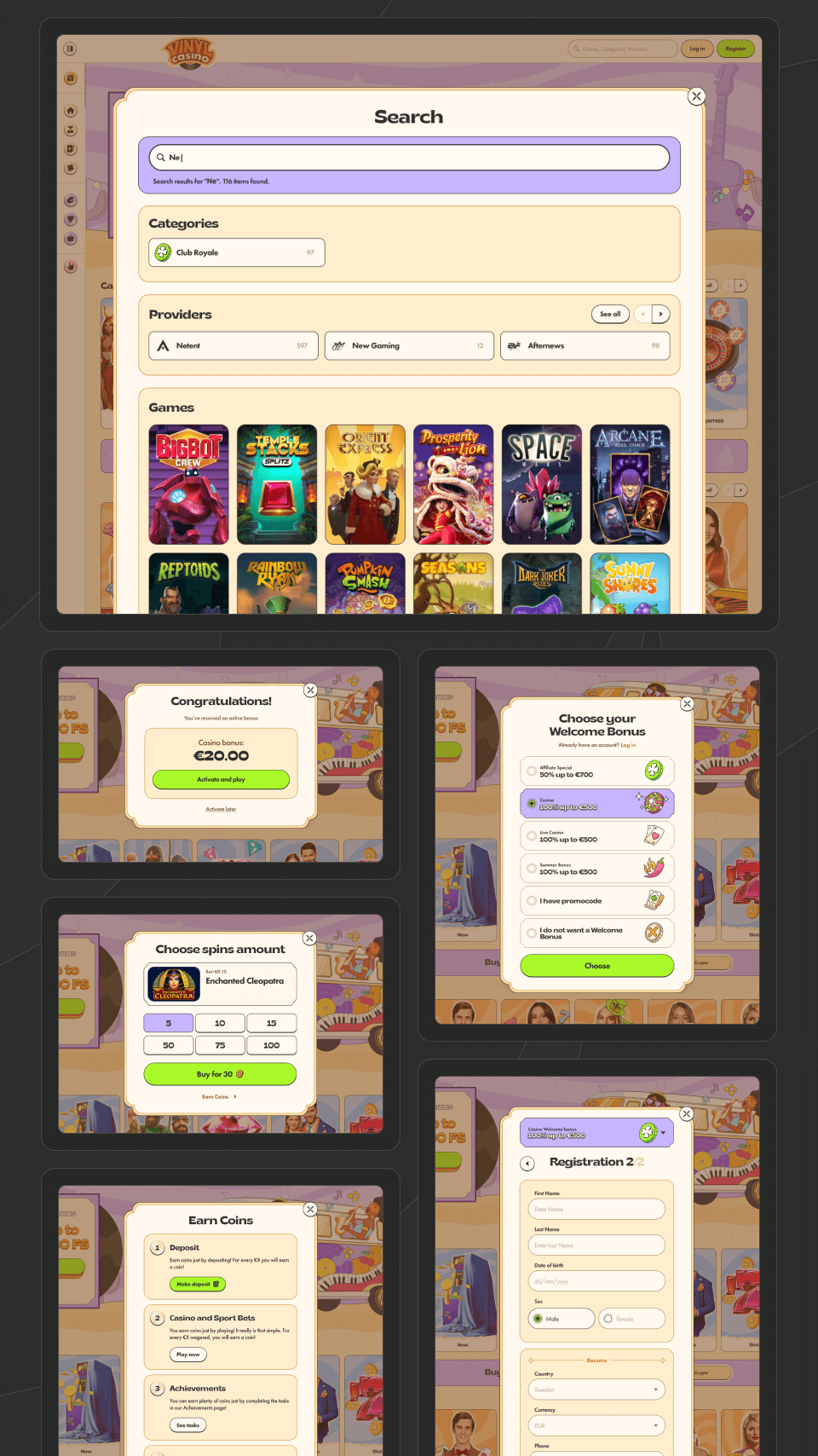
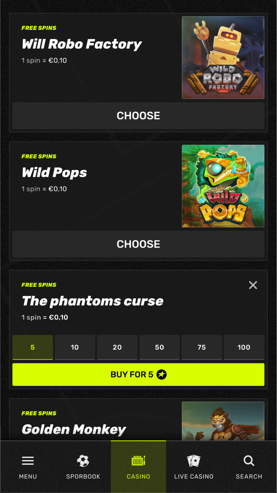
One key focus was making the system easy to get started with. We have created component, let’s just call it Magic Screen here. It was a universal screen that included everything: modals, popups, fullscreen views, landscape mode, and more. Designers could quickly switch layouts, swap elements, or change behavior using presets. This made creating new screens and flows much faster.
To connect visuals with logic, we added interactive prototypes for both user flows and use cases. That helped speed up design discussions — both inside the team and with stakeholders — by showing how things would actually look and work.
.webp)
As the system evolved, a basic numeric tokens system for spacing and sizing was implemented. This gave us better control over layout and made it easier to sync with the codebase. Our goal was to keep everything in-system and avoid custom one-off elements wherever possible.

We also knew there was a risk of making the system too complex. Based on our experience with the web system, we put extra effort into keeping it intuitive and easy to navigate. A design system should be a helper — not a hurdle.
To make onboarding easier, we embedded descriptions directly into the layouts. We also ran live working sessions with the design team where we went through the structure and key principles of the system step by step.
.webp)
Takeaways
Building the design system helped the business hit a key goal — launching visually rich digital products faster. Delivery time went down, consistency went up, and communication between everyone involved got smoother. The team got a tool that let them focus on decisions and visual detail, not technical routine.
For me personally, it was a project that seriously leveled up my systems thinking. I got a deeper understanding of adjacent areas — dev, product management, architecture. Most importantly, I learned to see the product as a whole: not just a set of screens, but as a living, scalable system.


.webp)